20. July – 11. Aug. 2012
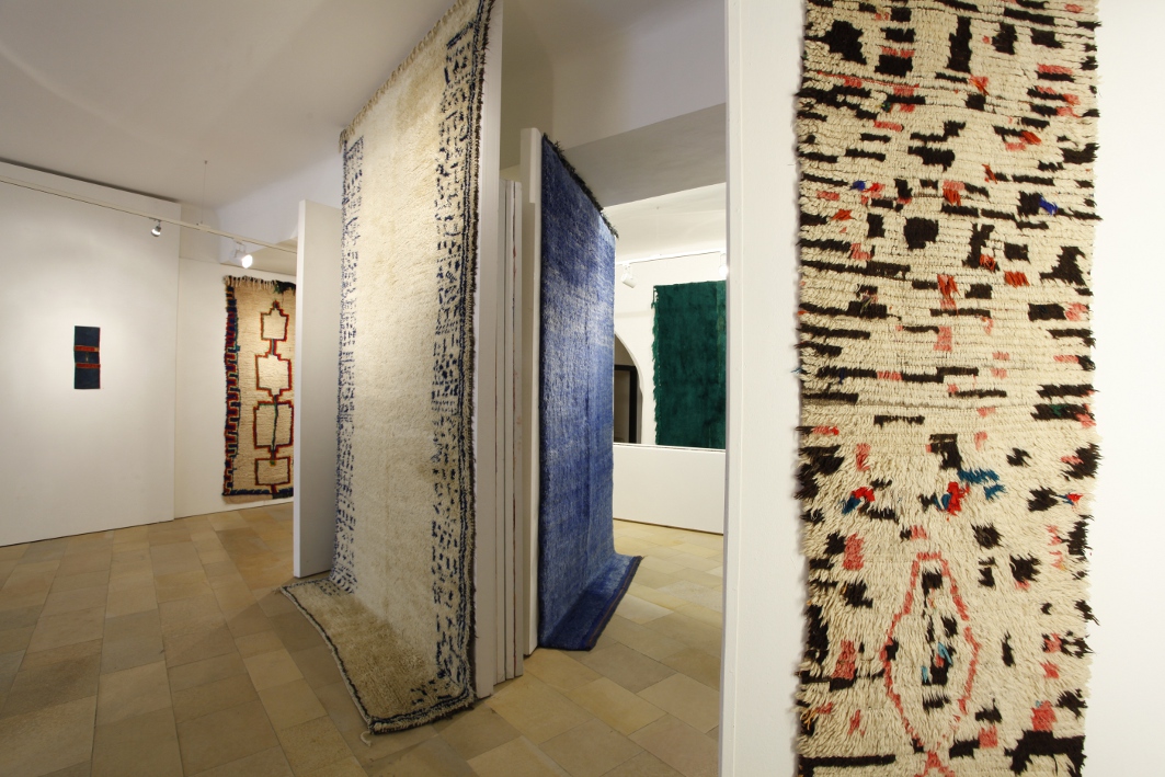
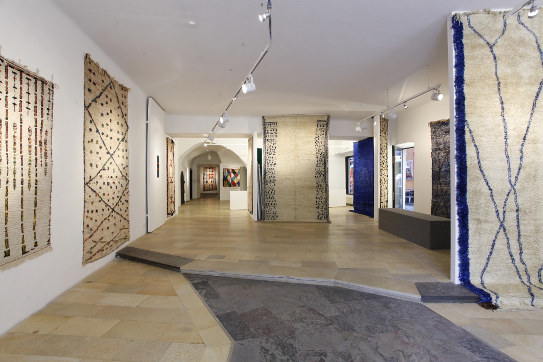
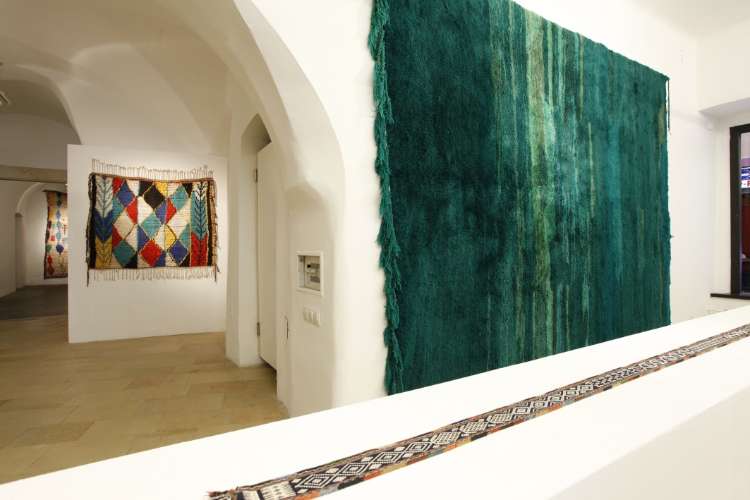
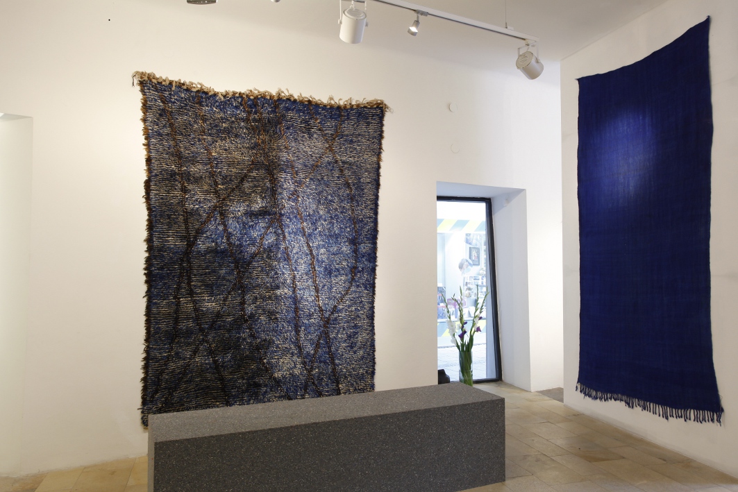
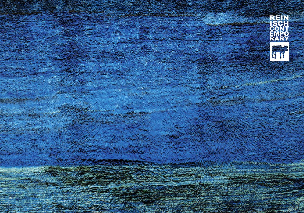
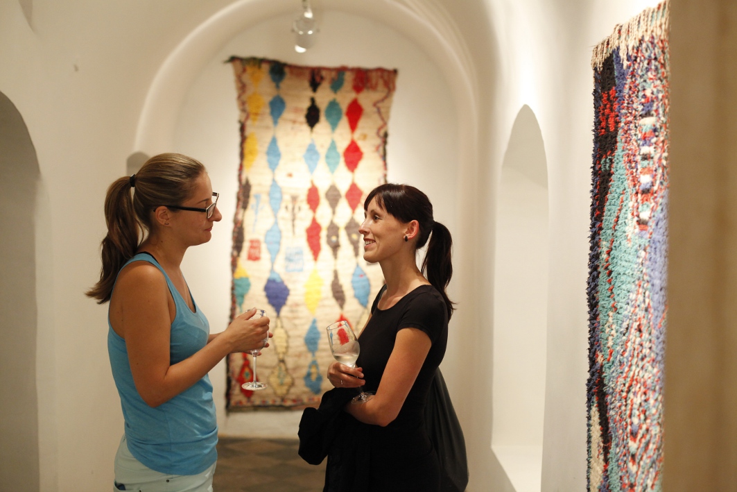
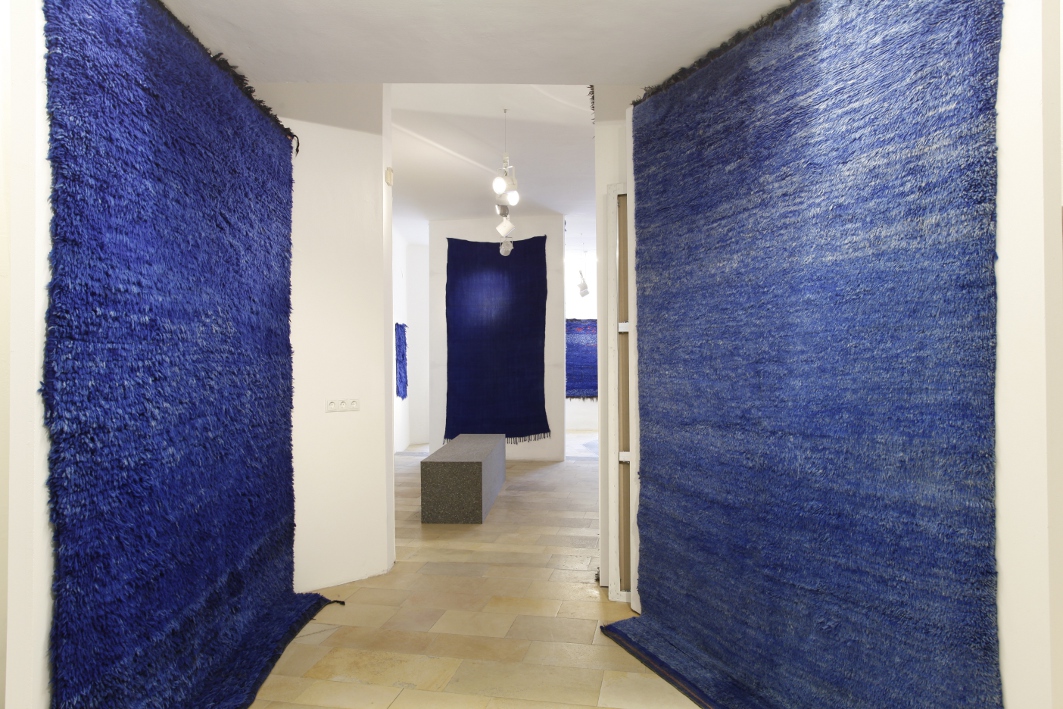
To surround oneself with cool colours during the hot months is a common practice to counteract the heat, not just in central Europe. Like European artists, Oriental nomads intuitively knew how to utilise colour effects in their textiles to ‘cool down’ their tents during the summer. Colour psychology plays a central role in this context. Blue, for example, is associated with air and water, the expanse of the summer sky and the unfathomable depths of the sea. It stands for coldness and distance, creates space and perspective – an effect, which was familiar to European Renaissance painters and which animated Post-Impressionist artists to create remarkable shades of light. Green is the colour of the centre and of equilibrium, of nature. In desert regions it is associated with fertility, affluence and life – a holy colour – since green is no matter of course in a sun-scorched landscape. White is the sum of all colours, stands for light and purity, and has a refreshing and soothing function, especially in combination with green and blue. Turquoise, the fusion of these colours, epitomises oceanic and glacial ice, and is psychologically perceived as the coolest colour. In terms of colour and design vocabularies, the hues of life mostly developed according to regional presets and climatic conditions – defining factors, which has shaped artistic practice across all periods and regions.
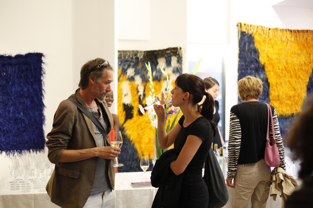
Manuela Schlossinger & Gerlinde Schiestl